Your color scheme can make or break the success of your website.
In this blog, I will show you how to attract visitors with an excellent color scheme.
Colors have a psychological impact on how we perceive the world. Therefore, it is crucial to choose colors that support your goals and purpose.
When a potential customer first sees your website, their perception strongly influences their first impression.
Let’s look at the example of Coca-Cola, which has built one of the most recognizable brands in the world. A major reason for its success is the red color, which evokes feelings of joy, energy, and celebration. Coca-Cola also became culturally associated with Christmas — even contributing to the modern popular image of Santa Claus.
-
Here are different colors and how they are typically used:
- Purple: symbolizes wealth, success, wisdom, creativity, and spirituality. It works well in industries such as wellness, entertainment, media, cosmetics, and salons.
- Blue: represents trust, security, and professionalism. It performs well in technology, finance, banking, healthcare, pharmaceuticals, travel, and e-learning.
- Pink: symbolizes femininity, love, inspiration, and softness. It is common in fashion, beauty, baby products, and event planning.
- Red: represents passion, energy, urgency, and importance. It is widely used in retail, media, sports, and automotive industries.
- Orange: symbolizes warmth, happiness, and creativity. It works well in education, travel, children’s products, and calls to action (CTA buttons).
- Green: symbolizes nature, growth, money, and health. It performs well in ecology, agriculture, finance, and wellness industries.
- Yellow: symbolizes optimism and attention. Combined with darker backgrounds, it can effectively highlight important elements.
- Black: represents professionalism, luxury, and formality. It pairs well with other colors when contrast is handled correctly.
- White: represents simplicity and cleanliness. Like black, it works across industries and pairs well with other colors.
Three key steps for creating a color scheme:
Choose a primary color that symbolically fits your business and brand.
Add at least two additional colors to build a balanced palette of primary, secondary, and tertiary shades. A useful tool for this is https://mycolor.space/, which helps generate color palettes based on your primary color.
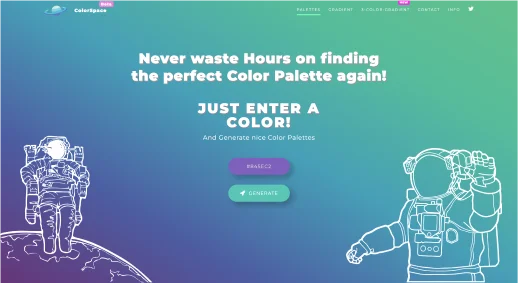
Entering primary color. 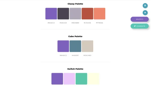
Examples of color palettes based on a primary color. The tool offers multiple palette options and simplifies the selection process. After entering your primary color, you can explore complementary combinations that harmonize visually.
Apply the colors using the 60/30/10 rule:
- 60% primary color (background and main elements),
- 30% secondary color (headings and supporting areas),
- 10% tertiary color (buttons and highlights).
This rule helps maintain visual balance while keeping important elements noticeable. You can also adjust it — sometimes the secondary color may dominate the background while the primary color is used for text or accents.
Important:
- Your website colors do not have to match your logo in every situation.
- You can use more than three colors if they are chosen thoughtfully and support usability.